Summary: If you’re exporting your blog from Tumblr to WordPress and want a Tumblr style theme, I recommend Nucleare or Twenty Fifteen.
I’ve recently helped export some blogs off tumblr to a WordPress installation. Tumblr is a great blogging platform – it’s terrific for quickly posting those random thoughts, code samples, and images one sees across the course of the day. But WordPress is a better long term solution, especially for blogs that are quickly growing.
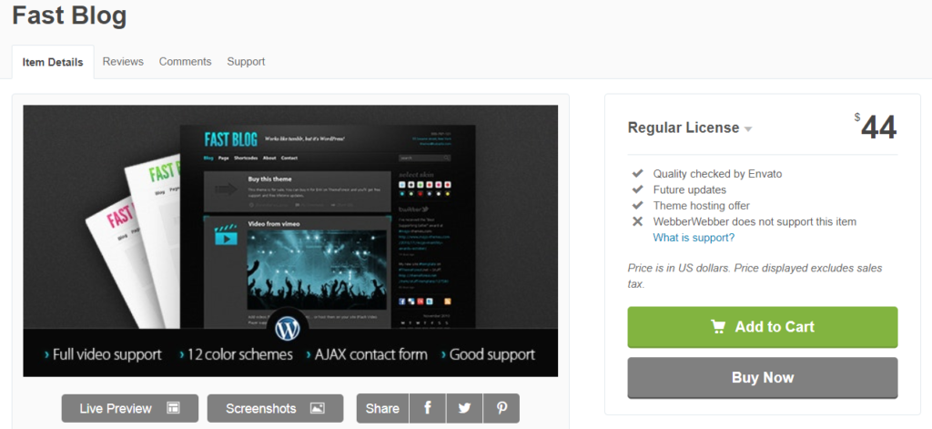
The hardest part of exporting a Tumblr site to WordPress is finding a theme that replicates the clean, neat design of Tumblr. I used to recommend a theme called Fast Blog ($44 from ThemeForest). Unfortunately, the theme is no longer available and in any event hasn’t been updated in years.
A friend of mine recommends Annina, which uses a big left navigation bar with a Pinterest-style multiple stacked boxes for each blog post:
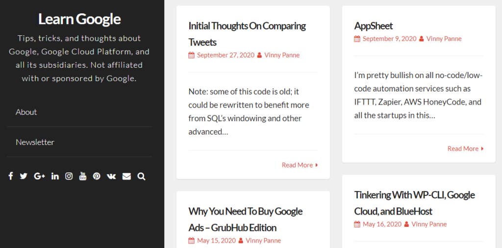
Annina is a good, basic theme that is fantastic for mobile devices: it’s easy for the navigation bar and post “boxes” to rearrange themselves to fit different mobile (tablet/phone) sized screens – a lot of blogs and sites are rearranging themselves to fit this aesthetic to earn those mobile views.
The basic version of Annina is free, but there is a paid version of Annina that unlocks additional features. If you’re a new blogger, the free version of Annina is more than enough.
Annina is a good theme, but my major complaint is that I want whole blog posts to show on the blog’s main page, not just the excerpt that Annina shows – just like Tumblr does.
My Picks
If you’re exporting a Tumblr website to WordPress and need a similar theme, I recommend either Twenty Fifteen or Nucleare.
Why Nucleare? It’s a crisp, clean theme that echoes the general lines of Tumblr, yet offers a reasonable amount of customizability.
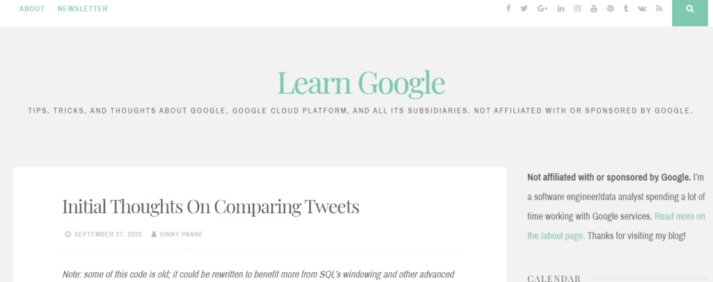
Perhaps my only complaint with Nucleare is the tons of wasted space around the title section and the inability to set the page width (I think it’s too wide on desktop displays). Otherwise, it’s a terrific theme that replicates the Tumblr experience.
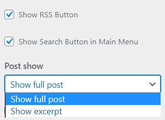
In the Appearance > Customize section of WordPress admin, you can change the theme colors and (even more importantly in my view) change how posts are shown on the main page: either excerpt or the full post:
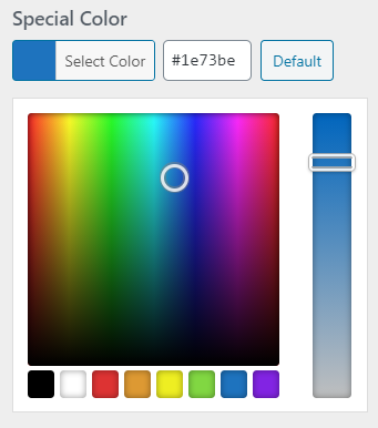
Another theme I would recommend is Twenty Fifteen. It’s the WordPress default theme from 2015, but it’s been updated by the WordPress folks to maintain good SEO and mobile performance. For the screenshot below, the only change I made was to alter the navigation bar background color to blue (hex code #1287a8; default for the theme is to leave it white).


Perhaps my only complaint with the Twenty Fifteen theme is that it includes a lot of padding and margin space around posts. I may end up cutting down that space using additional CSS.
So bottom line: Use Nucleare or Twenty Fifteen for those Tumblr blogs moving to WordPress. Both themes are free and have excellent defaults, along with good customization out of the box.