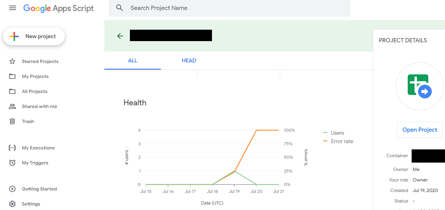
Health graphs always amuse me. I occasionally have to scratch my head and wonder what exactly is being measured.
Take the graph below. At first, the service has zero users and a zero error rate. But once it gets to 1 user (July 19), the error rate ramps right up to 100% and stays at 100% error rate even when there are no users using it (July 20 – 21 part of the graph).
How can there be an error rate if it’s not being used?
Just another day in amusing metrics.