I think the WordPress Twenty Seventeen theme is pretty close to the ideal starter WP template – it’s simple yet looks very nice, especially if there’s a nice header image.
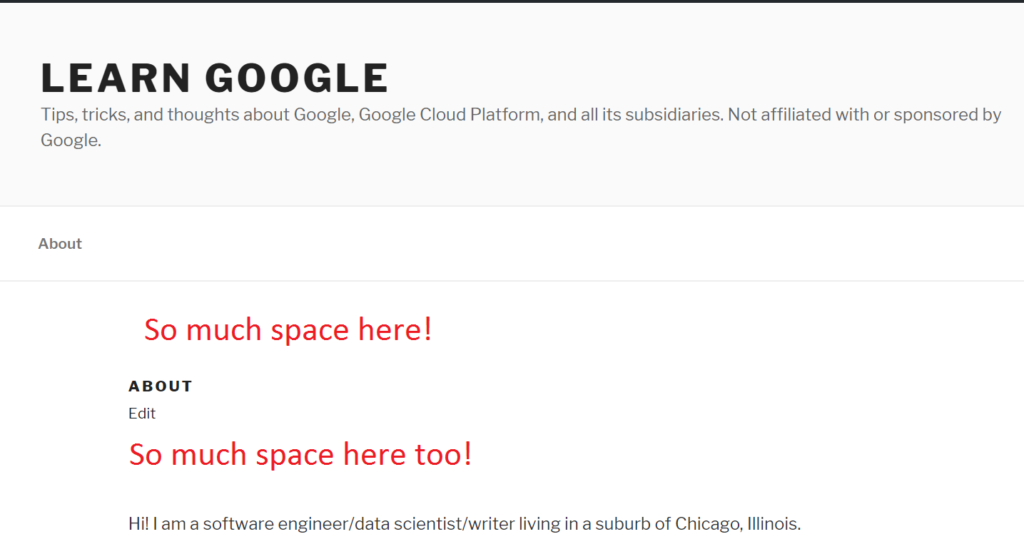
One of the major annoyances with using the theme is that there’s so much empty space in a default page. For example, here’s how my /about page looked like with just the default CSS (note how small the “ABOUT” text is, and it’s a H1 heading!):

I added the following custom CSS to help reduce the space and slightly increase the size of the H1 text:
h1.entry-title {
	font-size: large !important;
	font-weight: bolder !important;
}

header.entry-header {
	padding: 0 !important;
	margin: 0 !important;
}

div#content.site-content {
	padding-top: 1em !important;
}